
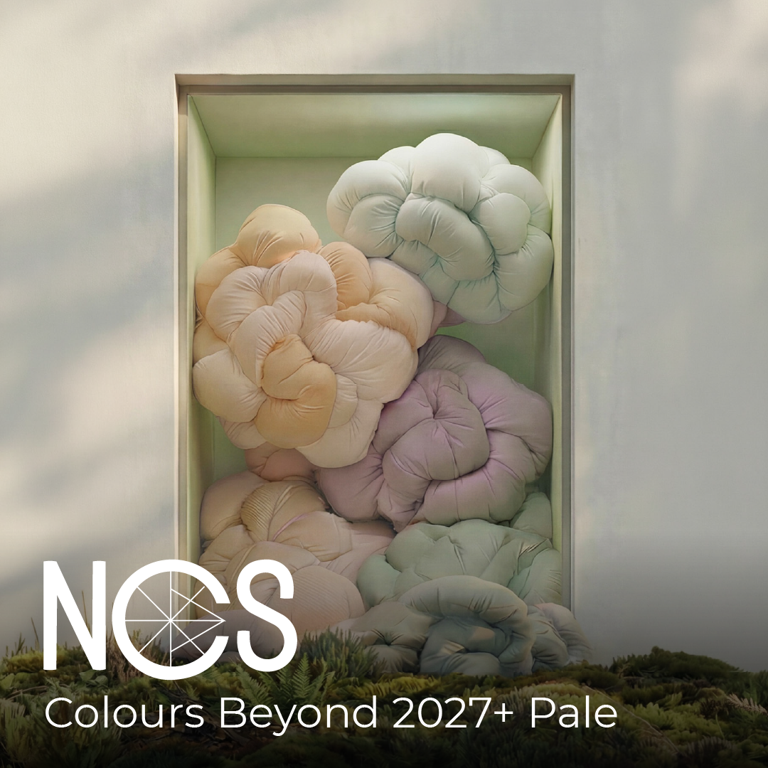
Pale colours in the NCS System are defined by low blackness and low to moderate chromaticness, giving them a clear yet gentle colour presence. Compared with Dull Pale, these nuances feel cleaner, brighter and more visually open, while still avoiding the sharpness of pure white or the intensity of highly chromatic colour.
A Pale colour such as NCS S 2020-Y50R, NCS S 2020-R10B or NCS S 2030-Y10R carries a soft but recognisable hue. These colours lift a space, soften light contrasts and smooth transitions, making them well suited to larger surfaces where atmosphere matters more than contrast.
Across the NCS Forecast Council, the Pale area reflects a shared need for environments that feel calm, supportive and emotionally steady. These hues offer clarity without coldness, and colour without distraction. They allow materials such as timber, stone, wool and matte plaster to breathe, creating interiors with quiet definition and spatial ease.
Pale colours bring a sense of calm focus into spaces – warm enough to feel human, but clear enough to keep the environment visually open and balanced.
Together, these perspectives define the NCS Colours Beyond 2027+: Pale colour area: low-blackness, moderate-chromaticness hues that open up the room, diffuse light beautifully and create a steady, calm expression across larger surfaces.
Pale colours offer presence without intensity. They are warm without heaviness, and clear without feeling stark. Allow materials, light and atmosphere to take the lead – supporting a quieter and more harmonious way of inhabiting space.
Behaviour: Diffuses light, smooths transitions, opens up space
Applications: Walls, panelling, ceilings, built-ins, quiet architectural volumes
What shapes NCS Colours Beyond 2027+: Pale area?
The Pale colour area emerges from a shared insight across the NCS Forecast Council: in 2027+, we seek spaces that support clarity, calmness and emotional steadiness. Across all regions and disciplines, the experts observed a movement away from loud expression and towards colours that create openness without feeling cold or clinical.
From China came reflections on the need for gentle, light-filled hues that make compact living environments feel more spacious. Italy highlighted colours that let architectural materials – wood, mineral plaster, stone – breathe and hold their natural texture. Scandinavian experts pointed to the value of warm minimalism, where light nuance colours create emotional ease without losing character. The UK and US noted the rise of multifunctional rooms that must hold work, rest and social activity simultaneously, requiring colours that regulate rather than stimulate.

From colour area to space
3 combinations of area Pale. The combinations show how Pale behaves when brought into real environments. Each one explores a different balance of light, warmth and quiet contrast, offering designers a starting point for shaping atmosphere and mood. Always keeping both other colours from the three colours areas that have been identified as important.
Quiet warmth
This combination is anchored by S 2020-Y90R, a warm, gentle Pale tone that introduces a soft blush-yellow warmth without imposing intensity. On larger surfaces it behaves like a lightly tinted plaster – diffusing light and creating a calm, enveloping atmosphere.
A supporting deeper tone such as S 5020-R adds subtle definition, grounding the palette in a muted red that feels tactile rather than bold. A refined accent, for example S 5040-R20B, introduces a deeper chromatic note that can be used sparingly to guide attention or enrich details.

Material suggestions
- Lime plaster or soft mineral paint reflecting light evenly
- Light oak or birch with warm undertones
- Soft-matte ceramic in muted pink-red notes
- Textiles in wool, boucle or cotton with a warm natural tint
Suitable for
Living rooms, bedrooms, calm hospitality spaces, quiet lounges
Quiet layers
This tonal combination begins with S 2030-Y10R, a Pale hue with a warm, softly golden character that offers more chromatic presence while remaining controlled. When layered with a muted neutral like S 5005-Y20R, the palette forms a gentle interplay between light and shadow.
A lighter supporting note such as S 1005-Y helps to lift the overall composition, creating airiness and spatial clarity. Together, these tones form a sequence of Pale layers that shift smoothly across surfaces, creating depth through nuance rather than contrast.

Material suggestions
- Pigmented lime plaster with a soft sheen
- Textured ceramics in warm ochre notes
- Wool or felt in soft beige tones
- Contemporary light woods such as bleached oak
Suitable for
Concept spaces, mood-led interiors, exhibition environments, soft public areas
Balanced natural light
This combination centres on S 5010-G30Y, a green-tinted tone that introduces a sense of calm freshness while remaining low in chroma. It works beautifully on walls where natural light can reveal its subtle, almost mineral depth.
A softer supporting hue such as S 2010-G70Y brings a gentle yellow-green warmth that harmonises with natural materials. A quiet accent like S 2010-Y10R adds a hint of warmth that helps balance cooler daylight conditions without overwhelming the space.

Material suggestions
- Matte lime paint with visible brush texture
- Honed stone or terrazzo in green-beige tones
- Natural linen or hemp textiles
- Light, softly grained timber such as ash or elm
Suitable for
Studios, workspaces, kitchens, reflective reading areas, wellness spaces
Visit your nearest Universal Paints Direct Outlet to Mix and Match your preferred NCS colour.
