

Interior colour palettes can completely change the way a home feels. The colours you combine — and how you use them throughout a room — can create a space that feels calmer, warmer, fresher, more dramatic or more expressive.
Choosing paint colours is therefore about much more than finding an individual shade you like. A soft neutral can create calm, deeper colours can add intimacy and character, while greens, blues, warm earth tones and expressive accents can give a room its own distinctive personality.
The key is finding a combination that suits your home, your decorating style and the atmosphere you want to create.
Universal Paints has put together five distinctive interior colour palettes, each offering a different mood and approach to decorating. Whether your style is calm and understated, warm and welcoming or colourful and expressive, these palettes provide a starting point for creating a coordinated home using colours from the NCS Colour System.
Five Interior Colour Palettes for Different Moods
Rather than choosing colours individually, working with a coordinated palette gives you a clearer foundation for decorating an entire room. Each of these five palettes brings together complementary shades that can be adjusted depending on how subtle or expressive you want your space to feel.
Highveld Skies: Grounded, Warm & Sophisticated
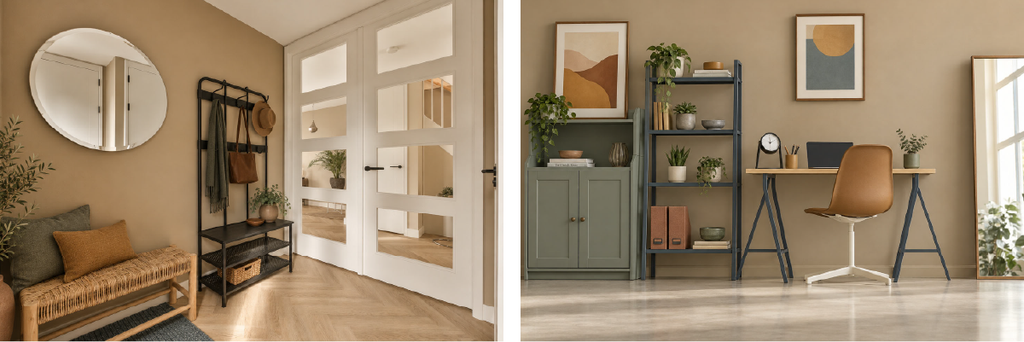
For interiors that feel comfortable, composed and sophisticated, Highveld Skies combines warm neutrals with muted green and blue-grey.
Golden Veld provides a gentle golden neutral that works well across larger areas, while Sunlit Ochre introduces a warmer, richer note. Earthen Clay brings earthy depth, balanced by the understated green of Thornveld Sage and the cooler blue-grey of Storm Veil.

How to use Highveld Skies
Start with Golden Veld when you want a warm and versatile foundation. Thornveld Sage can then be introduced through cabinetry, furniture or a selected painted feature, while Storm Veil provides a sophisticated contrast. Sunlit Ochre and Earthen Clay are ideal for adding smaller pockets of warmth without making the overall scheme feel too heavy.
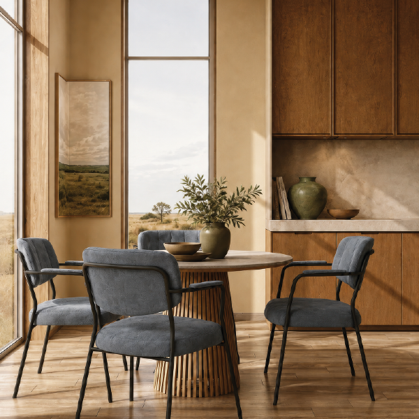
Best for: living rooms, dining rooms, entrance halls and home offices.
In a dining room, try Golden Veld on the main walls with Storm Veil introduced through upholstered chairs or a painted sideboard. Add Thornveld Sage in smaller features and finish the scheme with accents of Sunlit Ochre and Earthen Clay.
Coastal Shores: Calm, Fresh & Effortless
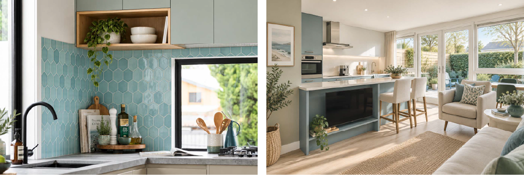
If you prefer interiors that feel light, relaxed and refreshing, Coastal Shores combines cool blues and greens with softer neutral tones.
Deep Tide is the deepest shade in the combination, giving the palette its sense of depth. Ocean Spray introduces a clearer blue-green, while Sea Mist offers a soft, light alternative. Windblown Sand adds warmth, with Milkwood Grove providing a muted green to balance the cooler colours.

How to use Coastal Shores
Windblown Sand and Sea Mist are both useful starting points for larger surfaces, particularly when you want to keep a room feeling open and airy.
From there, use Deep Tide more deliberately on a feature wall, cabinetry, headboard or statement furniture. Ocean Spray can add freshness through smaller painted details or furnishings, while Milkwood Grove creates an easy transition between the blue tones and natural materials such as timber, linen and woven textures.
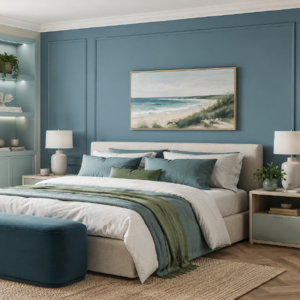
Best for: bedrooms, bathrooms, kitchens and open-plan living areas.
For a bedroom, try Sea Mist across the walls and bring Deep Tide into a feature wall or upholstered headboard. Introduce Ocean Spray through bedding and accessories, with Windblown Sand and Milkwood Grove softening the overall combination.
Jacaranda Essence: Expressive, Soft & Contemporary
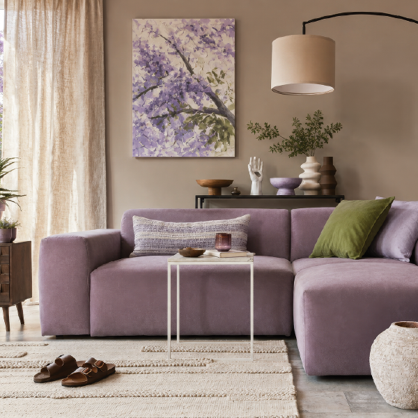
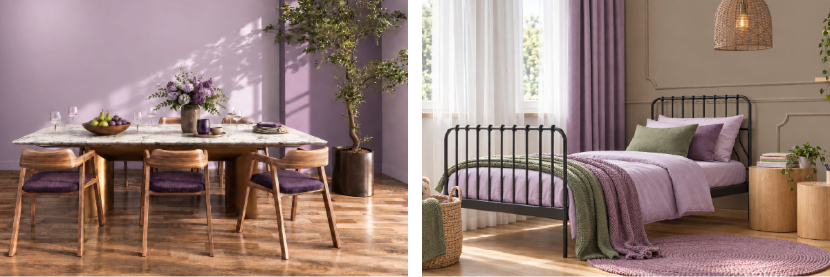
Colourful interiors don’t necessarily need to feel loud. Jacaranda Essence balances purple and lilac tones with green and warm brown to create a palette that feels expressive while remaining sophisticated.
Jacaranda Bloom is the strongest statement colour, complemented by the softer Lilac Mist. Lavender Veil introduces a deeper, more muted purple, while Fresh Acacia creates contrast. Aged Bark grounds the combination with a warmer neutral.

How to use Jacaranda Essence
The beauty of this palette is that you can make it as subtle or expressive as you like.
For a softer room, begin with Aged Bark or Lilac Mist and introduce the stronger purple shades selectively. If you want more personality, allow Lavender Veil or Jacaranda Bloom to take on a larger role through a feature wall, cabinetry or statement furniture. Fresh Acacia provides an important contrast and helps stop the purple tones from becoming too dominant.
Best for: lounges, bedrooms, dressing rooms and statement dining areas.
In a lounge, Aged Bark can provide the main wall colour, with Lavender Veil introduced through a sofa or painted feature. Add Lilac Mist through softer furnishings, Fresh Acacia as a contrasting accent and Jacaranda Bloom in smaller statement pieces.
Karoo Horizon: Warm, Rich & Inviting
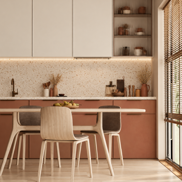
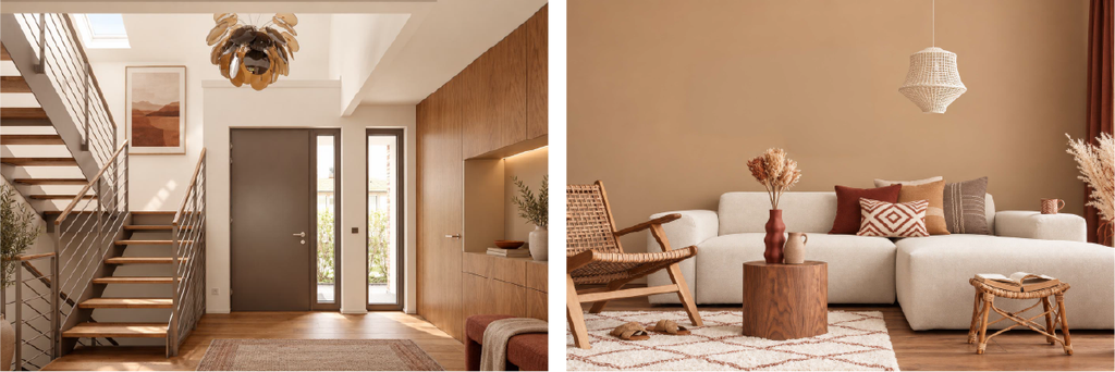
Warm colours can instantly make an interior feel more welcoming, and Karoo Horizon brings together terracotta, muted gold, deep red, soft off-white and earthy brown.
Ancient Earth provides the deepest red, while Canyon Clay introduces a warmer terracotta. Golden Karoo adds a softer golden tone, balanced by the lightness of Whispering Sands. Karoo Earth completes the palette with a deeper grounding brown.

How to use Karoo Horizon
The richer colours in this palette work best when given room to stand out.
Use Whispering Sands as a light foundation across larger areas, then layer Canyon Clay or Golden Karoo into selected walls, cabinetry or furniture.
Karoo Earth works particularly well alongside timber and other natural finishes, while Ancient Earth can become a strong focal colour when used more selectively.
Best for: kitchens, dining rooms, lounges and entrance halls.
In a kitchen or dining room, paint the main walls in Whispering Sands and introduce Canyon Clay through cabinetry or a feature wall. Bring Golden Karoo into furniture and textiles, use Karoo Earth for deeper details and finish with smaller touches of Ancient Earth.
Fynbos Fields: Fresh, Playful & Confident
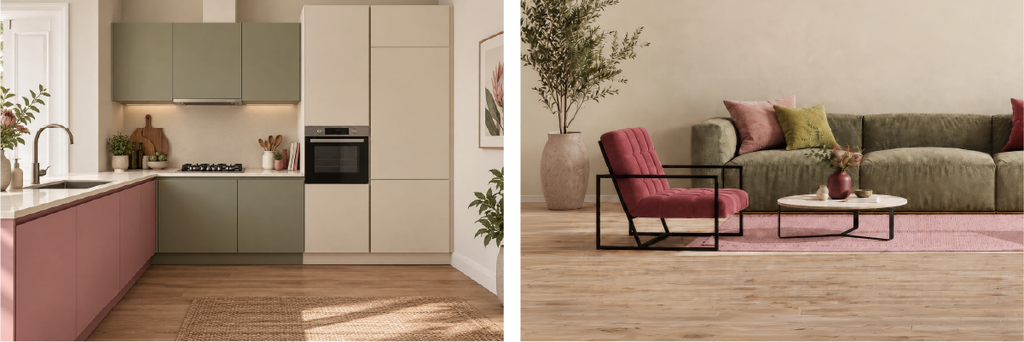
For those who enjoy bringing more colour into their interiors, Fynbos Fields combines fresh and muted greens with a soft neutral and expressive pink-red tones.
Wild Fynbos is the brightest green in the palette, complemented by the more subdued Renosterveld. Cape Sand provides a calm neutral foundation, while Protea Bloom adds a rich statement colour and Erica Blush offers a softer pink alternative.

How to use Fynbos Fields
Because this palette contains several stronger colours, the key is creating balance.
Let Cape Sand take up a larger proportion of the room and use Renosterveld as a grounding secondary colour. Wild Fynbos can then introduce a fresher burst of green.
Erica Blush is useful for softer accents, while Protea Bloom works beautifully as the hero colour through one carefully chosen feature.
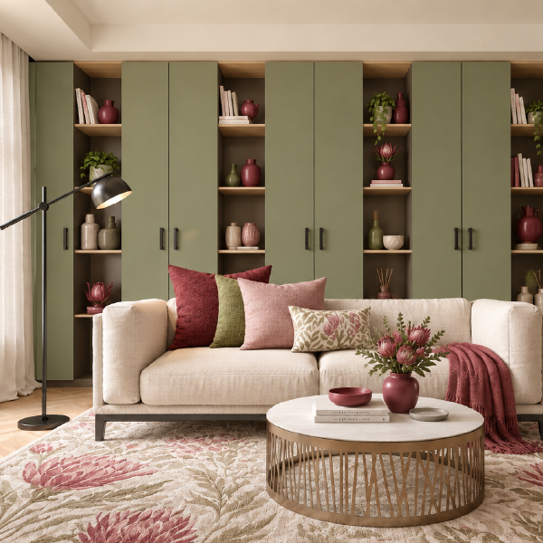
Best for: lounges, bedrooms, kitchens, sunrooms and creative spaces.
In a living room, Cape Sand can form the main backdrop, with Renosterveld introduced through furniture, cabinetry or a painted feature. Add Wild Fynbos through selected details, layer in Erica Blush through textiles and allow Protea Bloom to create one strong focal point.
Create an Interior Colour Palette Around the Way You Want to Feel
There is no single right colour palette for a home. The best interior colour palettes are the ones that create an atmosphere you enjoy living in while complementing the furniture, finishes and natural light already in your space.
Choose Highveld Skies for something warm and sophisticated, Coastal Horizon for a calmer and fresher feel, or Jacaranda Essence when you want more personality. Karoo Horizon creates a rich, inviting interior, while Fynbos Fields offers a fresher and more confident use of colour.
You also don’t need to use every colour equally. One shade might cover your walls, another could appear on cabinetry or furniture, while stronger colours are reserved for accents. Changing those proportions can give the same palette an entirely different personality.
Visit your nearest Universal Paints Direct Outlet for expert advice and product selection. Our team can help you explore the NCS Colour selection and create a combination that feels completely at home in your space.
