
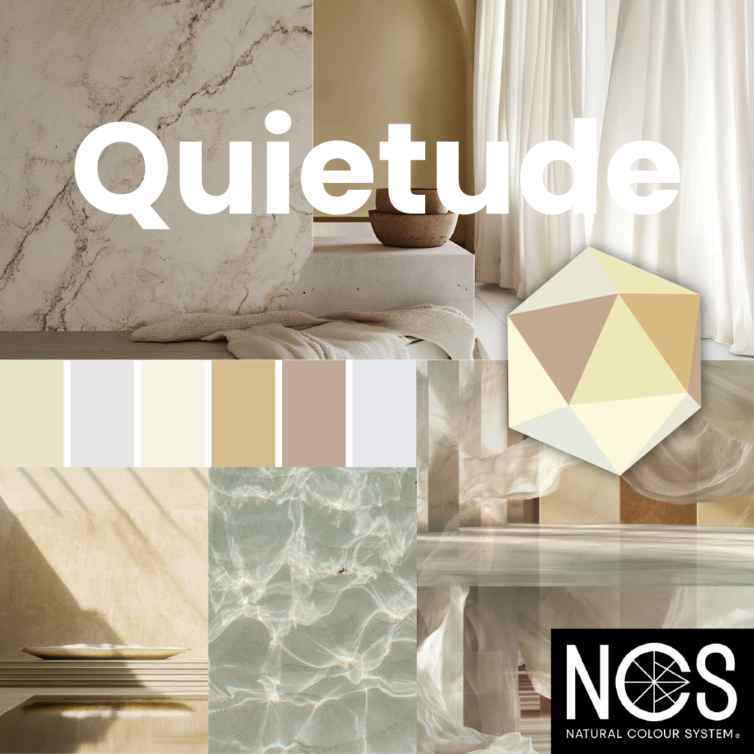
In a design landscape often dominated by extremes—either stark minimalism or colourful exuberance—Quietude emerges as a refined counterpoint. This thoughtful palette centres on “a constellation of imperfect whites and noble neutrals beyond convention,” gently ushering us into “a realm of timeless elegance—a mindful opulence that defies norms and soothes the soul”.
The Hero Hue: NCS S 1010-G90Y
At the core of Quietude lies NCS S 1010-G90Y, a limestone-inspired white with a subtle mineral vibration. Far from being sterile, this softly greenish-yellow shade brings an organic dimension to white—imbuing surfaces with depth, texture, and a sense of imperfection that reads as luxurious. Under daylight, it emphasizes an eco-conscious freshness; under warm artificial light, it morphs into a statement of subdued sophistication.
Supporting Palette: Soft, Warm, Natural Accents
This hero tone is complemented by a curated set of supporting shades, all low-chromatic and soft, designed to enrich rather than compete:
- NCS S 1002-R – A rosy white that adds approachable warmth to trims, mouldings, and doors—preventing the space from feeling too austere while staying serene.
- NCS S 0603-Y20R – A luminous wood-beige that evokes timeless craftsmanship and tactile materials—great for flooring, cabinetry, or furniture.
- NCS S 2020-Y20R – A pastel yellow-green that breathes gentle life and natural energy into accent walls, textiles, or décor, reinforcing a connection to nature.
- NCS S 3010-Y50R – A muted, earthy beige that brings refined comfort to leather, wood trims, or textiles—deepening the warmth of the overall scheme.
- NCS S 1001-B – A bluish-white that injects a crisp, cool contrast—ideal for ceilings or subtle highlights, ensuring the palette remains fresh and balanced.
Together, these tones create a harmonious narrative of natural elegance and understated beauty—a palette where each hue supports rather than competes, crafting environments that feel deeply calming and grounded.

Design Applications: Serenity Meets Material Craftsmanship
Quietude is more than a colour scheme—it’s an invitation to create sanctuaries of calm sophistication. Imagine reimagined living rooms, spas, or boutique hotels clad in this mindful palette:
- Foundational Surfaces: Coat walls and ceilings in the hero limestone white to achieve a serene anchor that feels both modern and ancient.
- Soft Architectural Highlights: Use rosy white for trims and door frames to avoid harsh transitions, maintaining visual fluidity.
- Naturally Grounded Elements: Incorporate the wood-beige in furniture or built-in cabinetry for tactile warmth and timeless appeal.
- Nature-Inspired Accents: Layer in pastel yellow-green via textiles or wall panels to introduce a note of organic freshness.
- Textured Depth: Add leather furnishings or woven textiles in earthy beige to bring sensory richness and emotional depth.
- Balanced Airiness: Apply bluish-white to ceilings or subtle details for maintaining a sense of lightness and spatial clarity.
The result? Interiors that feel curated yet lived-in, luxurious yet authentic—a balance rarely achieved in mainstream design.

Why Quietude Resonates Today
At a time when design increasingly seeks emotional resonance over visual opulence, Quietude stands as a thoughtful new luxury. Its appeal lies in authenticity: avoiding glare and glitz, it leans into tactile intimacy, craftsmanship, and a gentle connection to nature.
This palette aligns with growing preferences for sustainable elegance—spaces that are quiet, considered, and deeply human. Quietude doesn’t shout; it whispers—in tones of calm confidence and mindful living.
In summary, Quietude is a sophisticated invitation to embrace elegance that’s gentle, textural, and deeply authentic. Anchored by the imperfect mineral white NCS S 1010-G90Y and enriched through warm, nature-inspired neutrals and a cool counterbalance, it offers designers a palette for spaces that feel both timeless and exceptionally alive.
View the NCS 2026 colour trend video
See the complete NCS colour range
